
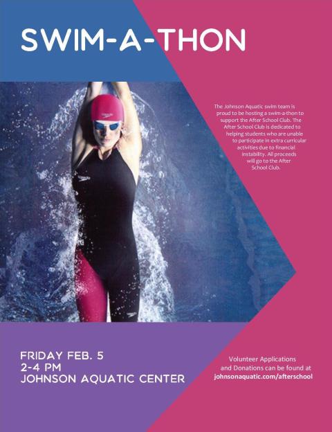
- Description: This is a flier used to promote a swim-a-thon to benefit an after school program.
- Process: I used Microsoft Word to create this flier. First I looked at my image and decided what a good color scheme would be. Once I figured out my colors I then started making shapes. I knew that I wanted the text not to touch the swim photo so I designed shapes around the image and put my text there.
- Message: If you volunteer to swim or donate money the proceeds will go to help an after school program receive money.
- Audience: My audience is anyone using the aquatic center.
- Color scheme and color names: Analogous: Indigo, Purple, Violet
- Top Thing Learned: How the text wrap influences how a shape looks and how it interacts with the page.
- Title Font Name & Category: Decorative: Aquatico
- Copy Font Name & Category: Sans Serif: Candara
- Scanned images used, sources, original sizes, location of scanner used: I used an image from Swim World Magazine. It was a 5×7. I used a my scanner in my apartment which is a Epson XP-310.

I really like the shapes that you used in your project, it makes your flier different and draws your attention. I also really liked the alignment of your text with the diagonal line next to it. It was cool that you didn’t necessarily use the exact color on the color wheel, you used the color that was in the picture. That unifies the color scheme with the photo. Your text is readable and easy to find the information. Great job!
LikeLike
Also, if you want to check out my blog the link is https://karaleejeske.wordpress.com/category/visual-media/
LikeLike